Alimaris
Structuring a premium Portuguese brand for international markets.
Alimaris was born as part of a business vision aimed at internationalization and growth in the premium food sector.
With a focus on Portuguese seafood for demanding international markets, including the United Arab Emirates, the brand needed more than a name or a visual identity.
It needed a structure capable of positioning origin, sophistication and curation in a global context.
The Context
Many Portuguese food brands communicate tradition.
Few manage to turn it into a premium international language.
The brand needed to:
- Stand out without losing its authenticity
- Avoid limiting its communication to cod or traditional Portuguese imagery
- Create a scalable brand framework for new products and markets
- Ensure cultural compatibility with international contexts such as the UAE
The central question was strategic:
How do you elevate Portuguese origin without falling into cliché?
The strategic decision
The work began by defining the brand's territory, before any visual or creative decision.
The following concept was defined:
Elevated Atlantic
A position built on:
Ocean purity
Rigorous curation
Gastronomic elevation
The brand should not represent merely Portuguese tradition.
It should represent the elevation of origin.
Strategic naming
The naming process was developed based on structured criteria, including:
- Etymological meaning
- International resonance
- Future scalability
- Cultural compatibility
- Premium potential
Different linguistic roots linked to the sea, curation and sophistication were explored.
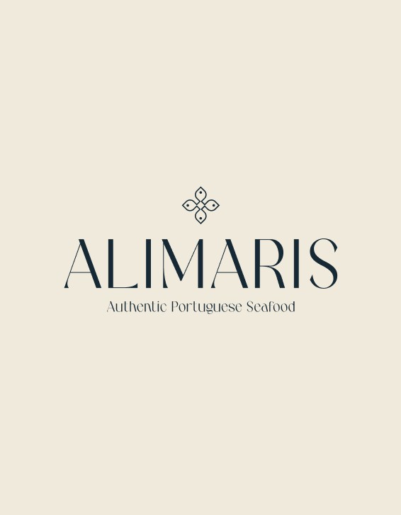
The final name, Alimaris, comes from the union of:
ALI
an Arabic term associated with elevation, nobility and sophistication
MARIS
a Latin expression meaning "of the sea"
More than a name, Alimaris embodies a strategic intention:
Elevate what comes from the sea.
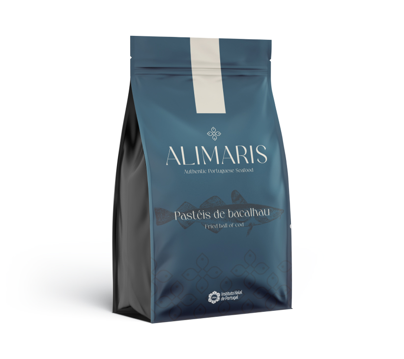
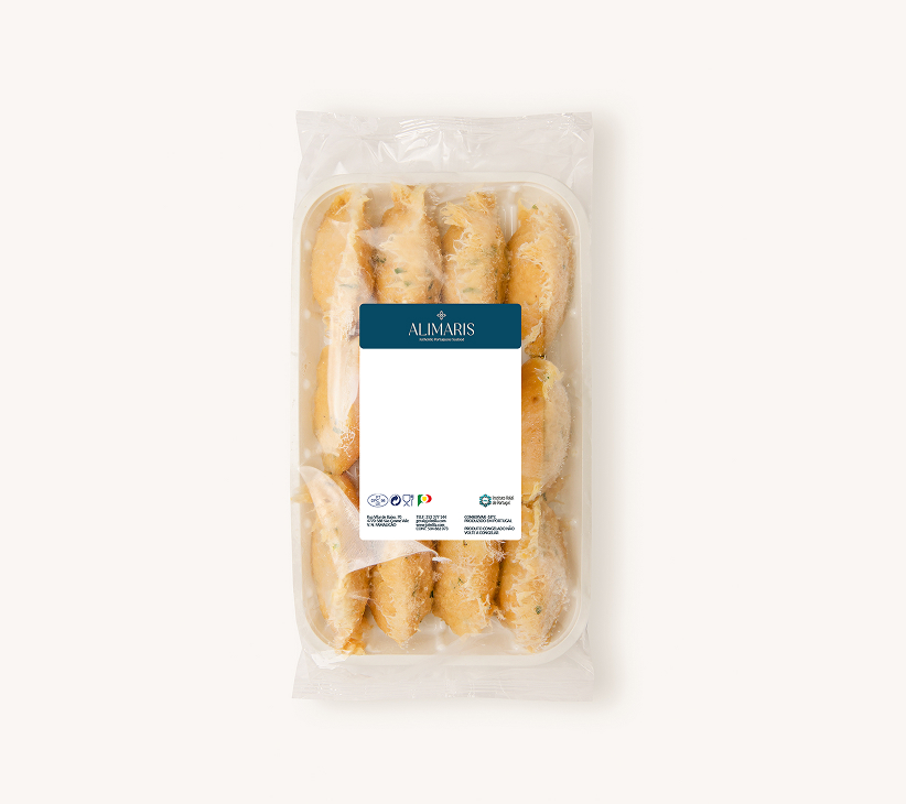
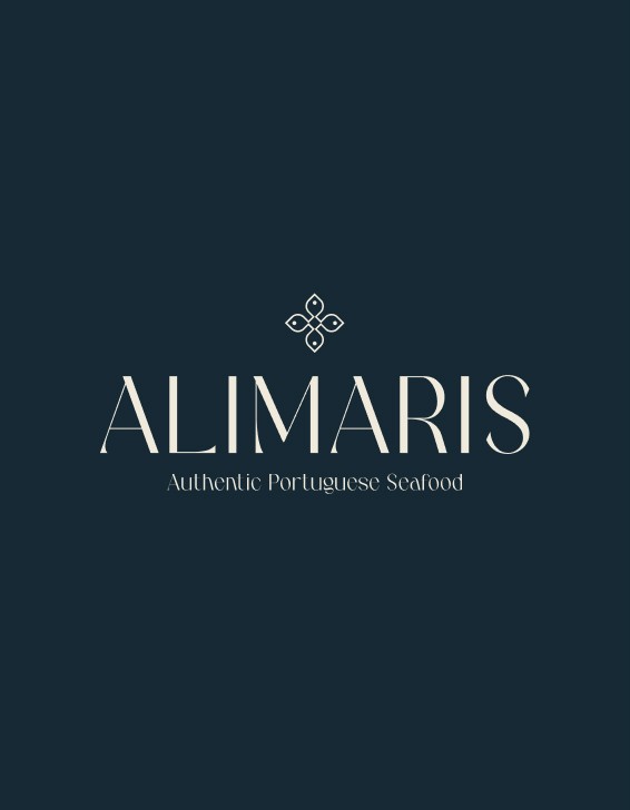
The visual identity
The visual identity was developed to reinforce sophistication, origin and exclusivity.
The symbol draws on Arabic mosaics and stained glass, subtly integrating the silhouette of four fish as a representation of the brand's maritime origin.
The typography was chosen to convey authority and premium positioning.
The color palette combines deep blues and sandy tones, evoking the link between the ocean and the Portuguese coast.
The visual system was designed to work coherently across:
- Packaging
- Labels
- Institutional communication
- Future product expansion
The impact
Alimaris gained a brand structure ready for internationalization.
More than a visual identity, the project defined:
- A clear strategic territory
- A premium international narrative
- A scalable foundation for future growth
- A brand able to compete in demanding contexts
The final decision wasn't aesthetic.
It was positioning.